As my good friend Tracy likes to say, flat is where it’s at. And she’s right—flat design is everywhere you look.
Direct marketing in particular has always worked best with simple, uncomplicated language along with design that eliminates any elements that don’t support the communication. Flat design is not only the perfect form to serve that function, it was specifically developed to do just that. The best marketing approach is the clearest and most direct. And that is what flat design is all about.
So, what is flat design?
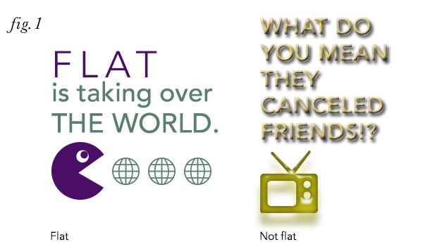
Flat design is a rejection of all things beveled, drop-shadowed and textured. It utilizes flat colors and simple, direct typography. See fig. 1.
How did things get so flat?
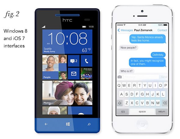
The flat design trend started in the technology world, as the use of handheld devices expanded. With more and more information being accessed and consumed on smaller and smaller screens, user interface design demanded simplicity in order to communicate as clearly as possible with the least amount of visual clutter. Along with eschewing things like drop shadows and glass buttons, flat design also adopted the simple illustrations of the informational graphics world (think men’s room/ladies’ room symbols, airport graphics, etc.) to say more with fewer words to read. Flat design has the added benefit of having generally faster download times than designs that have a pseudo-photographic look. See fig. 2.
The trend has since jumped to the world of print, video, product design, and you-name-it. Ubiquitous infographics, both online and on printed posters, are almost exclusively using a flat style. Complicated concepts and instructions, along with compelling marketing messages, are being delivered clearly and concisely through flat design. And helping all this along is the growing technological literacy of the world at large, so that now the meaning of simple graphic elements, thoughtfully developed, can be interpreted easily by most people.
Will the world be flat from now on?
Right now, anything with a drop shadow or bevel could make a design look dated. One challenge on the UI side of things is to continue to make sure users know that a button is a button, if not with a bevel or shadow then in some other way. But designers love a challenge!
How long will this trend hang on? In general, the marketplace is discovering that less truly is more, so flat design will be around for years to come. We will adapt it to our needs of course, because the message and response will still come first. But look for dimensionality, when it is used, to have much more subtlety, like shadows that are barely visible. And look for flat design elements combined with photography in interesting ways.
The best marketing approach is the clearest and most direct. And that is what flat design is all about—an emphasis on smart and beautifully designed typography, strong color, and clarity of message is a great thing. It’s time we all went flat.
Related:
Product designer Dieter Rams laid out his ten principles for good design in the 1970s. While he was mainly concerned with product design, I think they are relevant to the task of communicating, and they also show how the concepts behind flat design have been around for a very long time. Rams’ philosophy? Less, but better.