Many web design trends over the last few years have come about by a gradual evolution, rather than a sudden leap. Much of this has been influenced by the rise of mobile devices and responsive design, as well as an increasing desire to present information in a visually-appealing and accessible way. Some of the most interesting and important trends aren't brand-new, but 2017 will be the year they really shine. Many trends are even being combined to create richer experiences for users. Here are five examples that are likely to have the most impact on our digital marketing efforts.
1- Long Form Content
Long scrolling pages can be treated like a standard web page, but can combine various elements to tell a compelling, linear story. Features include animations, parallax effects, video, micro-interactions and more. The long page works well on desktops as well as mobile devices.
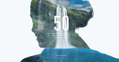
National Geographic takes you on a journey to the Grand Canyon here.

The PlayStation 4 uses animated illustrations and video to create an engaging experience here.

Long form content can bring an exciting interactive experience, but it also has the added benefit of higher search rankings, increased likelihood of social media sharing and, in the end, greater engagement than a standard landing page.
(Note: most of the following examples of other trends are being used within long form pages)
2- Cards
Cards aren't exactly new, but they have been growing in popularity over the last few years. Incredibly versatile and usable across all devices, they are excellent for displaying large amounts of information on one screen, allowing the user to quickly scan and make selections to attain more detailed information. Many of the big players (Facebook, Netflix, Pinterest, Twitter and LinkedIn) have adopted this and almost all of us are interacting with them on a daily basis now.
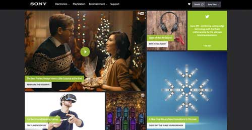
Sony uses cards in combination with videos on a long scrolling page.

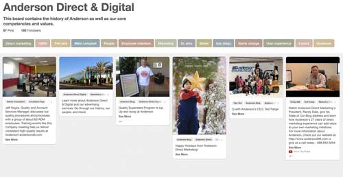
Our own Pinterest page is, of course, a great example.

3- Micro-interactions
Micro-interactions are small, on-screen animations that provide visual feedback for the user. They let us know where we are, what's happening and where we're going. They can create a subtle, yet more engaging experience and bring some fun into what might otherwise be a mundane process.
Some typical micro-interactions:
- Liking a Facebook post
- Rating a song
- Doing an online search
Note the heart at the upper right as well as the ability to get more information by holding down the space bar here.

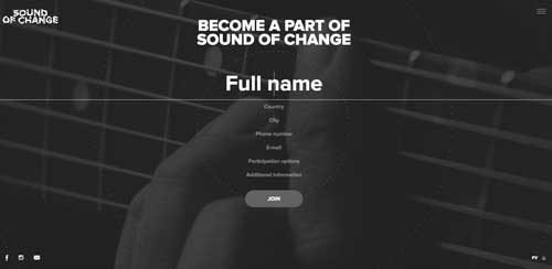
This site uses micro-interactions on a form in a very creative way.
4- Age-Responsive Design
Responsive design has become standard and has focused on making content usable across devices. Another area that is going to be addressed for usability is tailoring the content to the age of the user. Websites shouldn't be one-size-fits-all for devices, and it shouldn't be the same for individuals either.
Some considerations for age-responsive design:
- Adjusting elements such as navigation based on the competency of the user. More advanced options for experts and a simpler layout for the less experienced.
- Font sizes and spacing can be adjusted to accommodate the eyesight of older people.
- Color schemes can be changed to appeal to different age groups. More saturated hues for younger audiences and more muted, yet contrasting palettes for older users.
5- Authentic Photography
Stock photography has grown tremendously over the last decade. Authentic lifestyle photography has been a key response to the posed and insincere stock photos of the past. Yet stock photography is still a good way to connect with people and their emotions if used correctly.The photo on the left looks posed and somewhat artificial while the photo on the right looks like a real life moment has been captured.

The next level that we'll see more of is custom photography. There's no better way to visually stand out in a photographic way than to have your own photography that is tailored to your brand and your audience. While it may take more effort, for many in the online world, it's a great way to stand out from the crowd.
2017 looks to combine and refine many of the trends that have been tested over the last few years. Since the responsive revolution, web design continues to improve access and functionality across devices. This is great news for all of us who use the web, whether we browse on a laptop or a smart phone.


