Updated Dec 2015
Do you know how your customers use your digital products? In the music industry, if you were a record label and your audience wanted to listen to the song “Call Me Maybe” from Carly Rae Jepsen, their choices include listening to your song from a CD, MP3 download or online music video. In the email marketing industry, when your audience wants to read your email, their choices include reading your message in a browser or application on their smartphone, tablet or workstation. Is your next email ready for smartphone or tablet users? If you haven’t adapted your email templates for mobile users yet, here are a few interesting statistics that will make you want to finally update your email template.
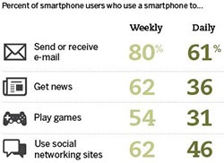
 Image from http://www.journalism.org
TOP ACTIVITES ON MOBILE DEVICES For smartphone users, the #1 daily activity on their device is to send or receive email (61%), followed by accessing social media sites (46%) and reading the news (36%). The #1 weekly activity on their device is also to send or receive email (80%), with accessing social media sites and reading the news tied at second (62%).
MOBILE EMAIL OPENS RATES As of March, 2015, Email Monday 45% of email opens occured on mobile, 36% on desktop and 19% in a webmail client. – Adestra “Top 10 email clients” (March 2015).
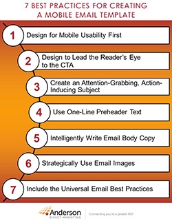
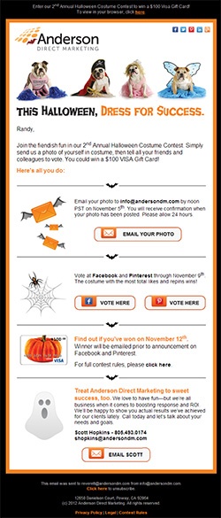
7 BEST PRACTICES FOR CREATING A MOBILE EMAIL TEMPLATE Now that you recognize the need to update your email templates to be mobile friendly, the next step is determining how to create a mobile email. To assist you, the Interactive Services team at Anderson Direct Marketing has created 7 recommendations for mobile email and provided two examples of our own mobile-friendly emails.
- Design the template for scalability on smaller mobile screens
- Use a one-column layout, larger fonts, smaller marketing images, and larger CTA buttons
- Design content blocks with tables and nested tables
- The email width should be 600 pixels or less. Litmus recommends between 320–550 pixels.
- Plan for smaller file sizes (JPG or GIF instead of PNG)
- Many designers recommend a 14+ pixel font for body text and 22+ pixel font for headlines
- CTA buttons should be design for the minimum finger size of 44 pixels in height and/or width or more
- Utilize the “Click to Call” feature as a CTA (if applicable) when a phone number is included
 Best Practices for your Mobile Email Template[/caption]
2. Design to Lead the Reader’s Eye to the CTA (Call-To-Action) for Higher Conversions
- Balance text and images (60/40 is a good ratio)
- Place your first instance of the primary CTA above the fold
- Ideally use 1 CTA goal per email (or up to 3), but for each goal try to include more than one CTA (top & bottom) to avoid scrolling for the reader
- See more tips on how to optimize your emails.
- Make the reader want to read more or take action with creative, short (<35 char) and clear message
- Use actionable language while maintaining clarity of the purpose
- Personalize if possible
- Align your Subject copy with the Body copy
- Test against spam scoring. Avoid “spammy” words like: free, limited-time, act now, cash, win, test
- For tips and examples, refer to StrongMail's advice on how to write subject lines
- Preheaders are usually 1–2 lines of HTML text at the very top of the email
- They are ideal for mobile devices to highlight an enticing offer, making it the first thing prospects read before they even consider downloading images
- The first 20–40 characters of the preheader text are also visible in most preview panes, so put keywords to the front of the line
- You can opt to include a mobile-friendly URL link in the preheader text as a CTA
- In addition to the preview lines that appear in web clients, many email clients have a 300-pixel preview pane. Therefore, ideally plan for your primary CTA and most important content to appear within the top 300 pixels.
- Be short, concise and to the point
- Talk about benefits, not features
- Keep the main message and its CTA above the fold
- Use actionable language in each CTA
- The copy in the first paragraph is critical and must be appealing to read more
- One important thing to keep in mind if you use small font size in your layout: webkit email clients (iPhone, Pre, and Android) will increase font size on text smaller than 13px, which could potentially break your layout. To avoid your text being resized, define in the CSS.
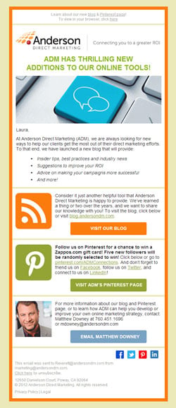
 Mobile Email Template designed by ADM[/caption]
6. Strategically Use Email Images
- Use images carefully and strategically, since many email clients block images unless manually allowed
- Don’t use images for your primary headline or your only CTA, since they might not appear
- It's recommended that your first full-width image appears after the headline, so if images are blocked there's not blank space before your headline
- Use ALT text for each image, due to the high number of email clients that block images
- Plan for smaller file sizes (JPG or GIF instead of PNG)
- Add padding (10–15 pixels) between CTAs or links since the average finger size is 44 pixels
7. Include the Universal Email Best Practices
- Always create a plain-text version of the email, and provide a link to it in the preheader area
- Provide a link to the hosted version of the email
- Include Social Media links. According to Econsultancy, emails that include just one social sharing button have 30% higher click-through rates than those without social sharing options. Did you know that when you offer three or more, the click-through rate jumps to 55%?
- For links in the email, use absolute links (full domain and path) instead of relative links (path only)
- Use a real, functional REPLY-TO address
- Test, test and test again! Your tests should include using different browsers and mobile devices, as well as always sending a test message to your internal QA team and key stakeholders.
MOBILE EMAIL RESOURCES Email Monday Anatomy of a Perfect Mobile Email Email Standards Project Acid Test How to Create Marketing Emails Both Readers AND Inboxes Love How to Write Email to Get a Better Response Rate HubSpot Email Guide: The best practices of designing and coding email templates The Foundations of Coding HTML Email The Future of Mobile News 9 Must-Have Components of Compelling Email Copy 10 Email Design Best Practices for a Mobile World For more information to create or blast your mobile-friendly email message, please contact the Anderson Direct Marketing sales team about our Email Marketing services.


