The last few years have seen some big changes in the world of digital design. With the rise of mobile devices and the importance of usability as primary influences, 2016 is likely to be a year where we see many of these trends reach maturity and become more refined. Here are 5 design trends for 2016 that you can expect to discover and see becoming a standard.
1. Flat 2.0
The flat design trend that came in and largely replaced skeuomorphism (realistic-looking design) has continued to grow and has moved on to Flat 2.0 aka Semi-flat design. Based on Google's tremendous amount of data on user behavior, page load speed and clear visual communication are still top priorities. Use of a clean and minimal style is the key ingredient, but Flat 2.0 design adds a touch of detail and depth back in, which helps bring some sophistication and extra dimension to the visual experience.
The ever-evolving button. The Semi-flat button brings back depth, which makes the button look more pressable.

2. Card-Style Interfaces
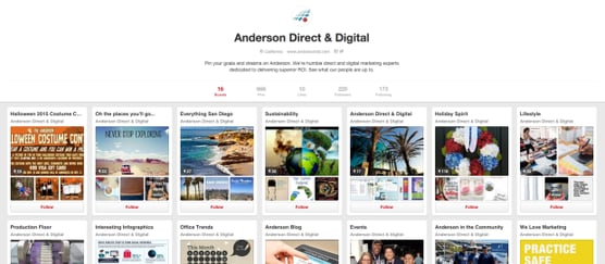
Card-style interfaces can be found everywhere these days, from apps to websites to print. A card is a user-friendly, easy-to-scan container that has won over users and will be here to stay for awhile. It doesn't hurt that cards are also very friendly across all devices. Pinterest and Tumblr are great examples of sites that use cards.
The Anderson Direct & Digital Pinterest Page
3. Beautiful Typography
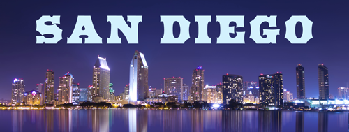
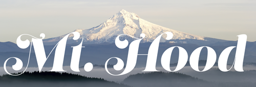
Big, bold lettering adds character and emphasis while being very easy to read. Web font tools such as Google Fonts and Adobe Typekit have made it easier than ever to choose from a much wider selection of fonts for web than in the past. With the extremely simplified look of flat design, utilizing a wider selection of stylized fonts can be a great way to add some unique personality to a website or landing page.
Examples of BIG and BOLD fonts from Adobe Typekit
4. Illustrations
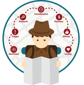
Illustrations have become more commonly used and can add a light-hearted visual side to help designs stand out and hold the user’s attention. Hand-drawn work has a personal feel that can be great for clear communication. Illustrations are also typically very small file sizes compared to photographs.
5. Cinemagraphs
A cinemagraph is a moving image that can capture the eye, like video, but won't take up a lot of bandwidth. These can be great creative opportunities that can stand out from the crowd by adding a layer of visual interest to an ad or website. Cinemagraphs aren't entirely new but are likely to become even more popular in the next year.
Check out some neat cinemagraphs here.
These are strange and exciting times for designers and users alike. With the advance of browser capabilities and mobile devices, many of the restrictions that we once had are now a thing of the past. While it seems a bit odd that Google is now giving global creative direction to the world, there are some great advantages to these changes. We can look forward to another year of improved user experiences and creative exploration.
