Chances are, the landscape of your art director’s desk looks a bit different than yours. And it’s likely that she spent a lot more time than you did choosing and maybe even designing her smartphone cover. But here are some important things your art director really cares about, and why you should care about them as well.
Typography. While most Anderson clients have established typographical guidelines, it still takes skill and experience to make them work for a given program. Typography conveys personality, tone of voice, and even the perceived quality of your product or service. When poorly or haphazardly done, it can be like trying to shop in a store during the holiday rush — it’s messy, you’re not sure where to look, and you’re wondering whether coming here was such a good idea in the first place.
When an art director starts designing text, many considerations come into play. What kind of typographic approach is suitable to the medium? In what environment or context will the reader experience this? Who is my audience and what expectations do they have? How should the message be communicated, not just within brand guidelines, but to boost brand awareness at the same time? All this and more will affect the designer’s approach to font choice, size, style, leading, alignment, tracking, kerning, and a lot more.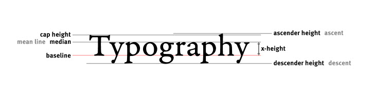
Proportion. In the simplest terms, proportion refers to how objects compare or relate to each other within a design. But as far as your art director is concerned, proportion is a key to effective communication. Designers use proportion to spark interest, get attention, and create a visual hierarchy. And it’s not just the relative size of objects that’s involved: color, weight, density, and focus can all be elements to be manipulated to achieve the desired result.
A designer using proportion well is designing for impact, not balance. For example, a page that is perfectly “balanced,” maybe even appearing to be divided equally in half by design elements, would be considered a bad use of proportion, creating monotony and disinterest. But elements being too unbalanced will create a sense of discord, which is probably only useful for your 13-year-old’s punk band’s flyers. In our world, effective marketing art directors use proportion to make the work pack a punch while also creating a sense of harmony within the design.
White Space. Like the early explorers of the Americas, art directors and designers have always looked for more space. White space, to be exact. Why? Because everything we’ve talked about so far depends on it.
The term white space really refers to negative space, so of course it isn’t necessarily white. Margins, space between columns, space between lines of text or characters, and gutters are all examples of it. They are what we might call Passive white space.
But Active white space is what is most important to us as marketers. Active white space is what the designer builds into her work to communicate better; to say “look at this” and “read me,” to make the layout appealing, to create a sense of positivity and intention, to make the message strong and clear. The effective use of white space is one of the main reasons why we hire a designer in the first place. Any piece without it, in any medium, is simply occupying what we can truly call “wasted space.”
Your art director cares about these things not just because he can’t help it, but because your program deserves it. Besides, if we don’t pay attention to them, we’ll still be saying something to our audience, for better or worse. As Paul Watzlawick famously said, “One cannot not communicate.”